
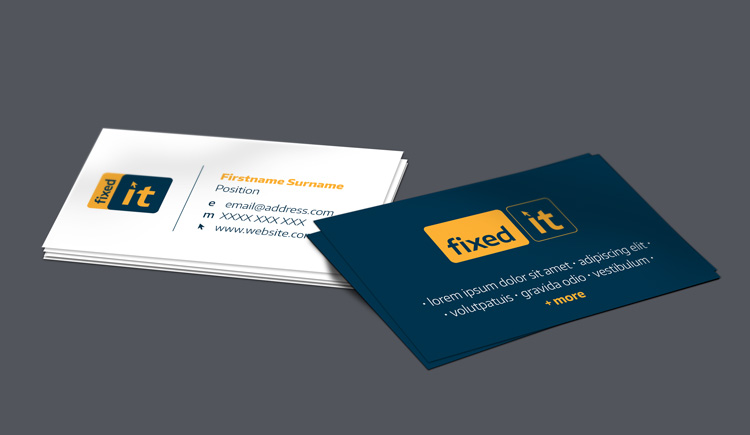
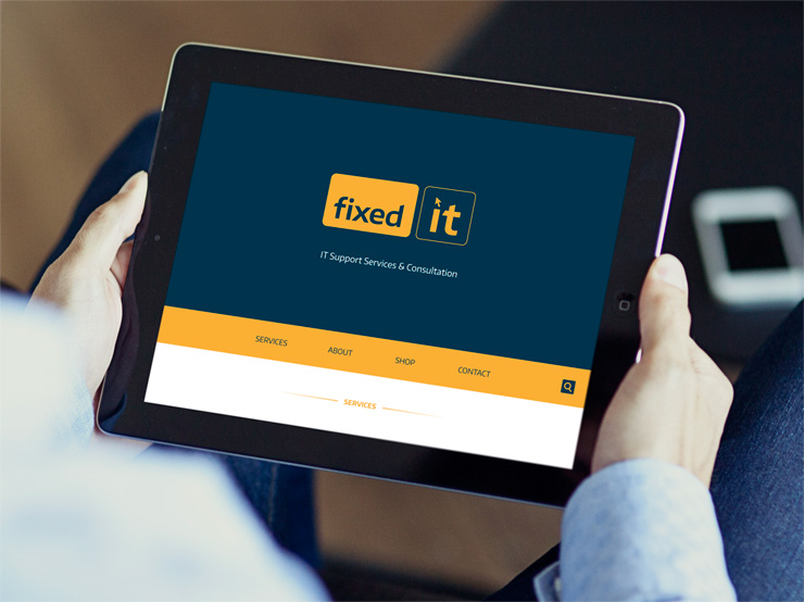
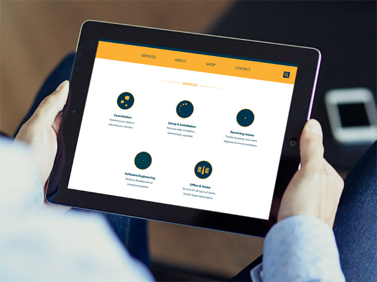
Fixed IT is a small consultancy providing services that include network administration, system design, software engineering and general troubleshooting. Their logo needed to be easily recognizable as a business that helps with computers. The concept that was developed into the final logo was inspired by computer keys.
An approachable feeling is created through the use of rounded corners and the colour orange, while the dark blue and sharp letters represent the sharp mind of a professional who knows what they are doing. To convey how easy this business is to work with I have kept a clean and simple style in the way that they will keep communication simple and easy to understand for those who are less familiar with technology.
Graphic Design – 2014 – 2015